Come springtime, the official Masters website always pops onto my radar. I hit it up to check on changes to the course, the latest news, and of course all of the interviews, audio (Masters Radio) and video you can shake a stick at. This year it looks like we’ll be able to get our fix on a brand new and ‘stunningly simple layout’ recently launched at Masters.com. Go ahead and check it out right now.
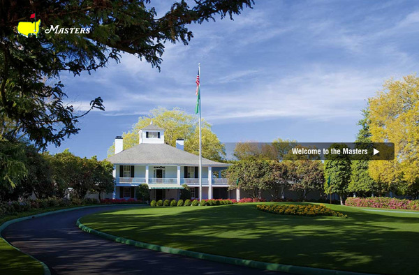
Upon arrival, you’ll be greeted as the players are… With a beautiful image of Magnolia lane, the clubhouse (built in 1854, by the way), and ‘founders circle’ in plain view. Click the welcome button and you’ll be directed to the main site.
The rest is easy. Use the navigation bar at the top to move your way around, read the news, check out pairings, players, course info and much more.
A tip of the cap to The Masters yet again, the new site looks great… and I particularly love the hi-res course images used as backgrounds throughout the site. It really shows off and brings to life the best part about the years first major… the beautiful Augusta National golf course.
[Via: @The_Masters]


